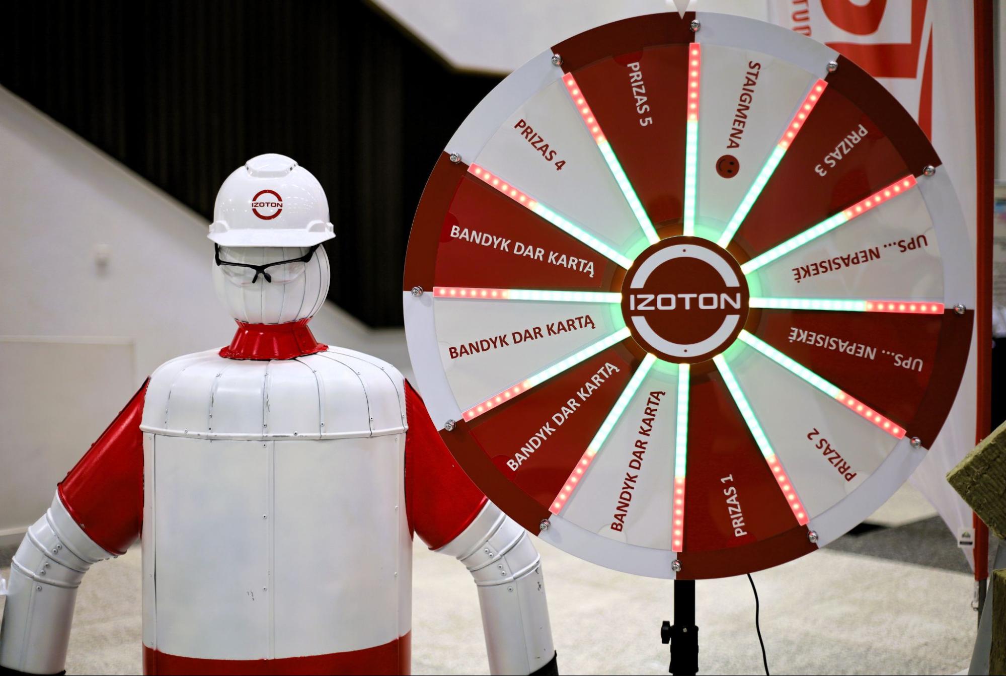
A NEW CHAPTER: IZOTON Rebranding
IZOTON is entering a new stage of development — we are introducing an updated brand identity that more accurately reflects our direction, strengths, and ambitions. For more than 17 years, we have earned a reputation as a reliable partner in the marine interior installation and repair sector, and this brand update marks a consistent step forward — toward a more mature, modern, and internationally recognizable IZOTON.
While our name and signature red color remain unchanged, the visual identity has been fundamentally renewed. The modernized logo, refined typography, new font, and unified design system strengthen the professional image we build in every project. The updated typographic style is cleaner, more precise, and better represents our engineering accuracy, technological progress, and contemporary identity in the global market.
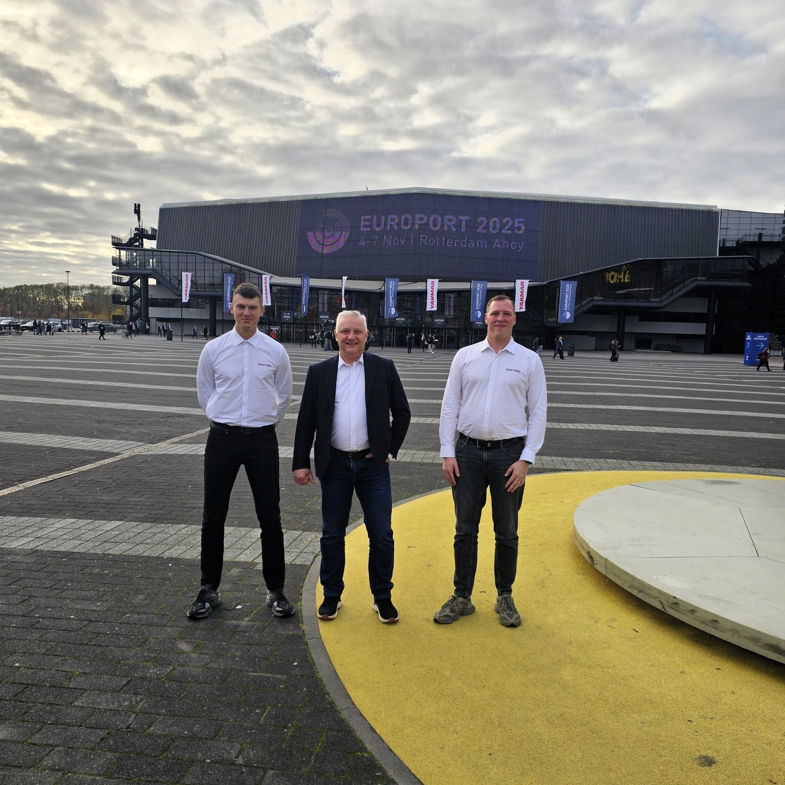
This is more than a design refresh — it is a complete update of our communication system. It enables us to clearly showcase our specialization, maintain a consistent and strong identity across all channels — from documentation and visual materials to infrastructure, transport, and workwear — and enhance our competitiveness on the international stage.
The new IZOTON logo reflects the essence of our work — precision, technical professionalism, and strong partnership within the maritime industry. We chose clean geometric forms and a vibrant red color to maintain a modern, dynamic, and easily recognizable identity. It symbolizes our growth, ambition, and intentional step toward greater visibility in the global market.
The updated brand strengthens our market position and enables us to present our services to partners and clients more effectively. It is a visual step forward, marking a phase of strategic transformation and accelerated growth — a period in which we confidently move ahead while upholding the highest standards of quality, professionalism, and reliability.